This tutorial is an introduction to hand lettering for beginners. Click here to download a printable Beginner’s Guide!
1
When selecting a paper, you don’t want it to be too slippery, so copy paper isn’t the best choice. You also don’t want it to be overly textured, because that makes it difficult to control your lines. I prefer sketching paper because it has a little bit of grip while providing an adequately smooth surface.
2
A beautiful end result starts with good drawing tools. Investing in two or three nice pens will significantly improve your work. Look for a pen that has permanent, archival-quality ink. It should also feature a precision tip and consistent ink flow. My personal recommendation is Sakura’s Pigma® Micron®. It comes in many colors and a wide range of nib sizes. They’re available at most stores that carry fine art supplies.
3
You’ll also need a pencil for sketching. A mechanical pencil is preferred for making lines that are fine and light. Make sure it has a good eraser. My favorite pencil is Sakura’s Sumo Grip®, because it’s comfortable to use and has an extendable eraser
4
If you’re interested in adding color to your work, Sakura’s Koi® Coloring Brush Pens are the best investment you could make. The brush tip makes it easy to fill in large areas or to trace fine lines.
What Is Hand Lettering?
Hand lettering is the art of drawing letters to create an aesthetically interesting design. It’s a relatively inexpensive hobby and a beautiful way to express yourself. Here are some supply recommendations to get you started…
Anatomy of a Letter
It’s helpful to first become familiar with the anatomy of a letter. Choose a font and study it carefully.
- Pay attention to the terminals, or tips, of the letter. Does it have a serif? Is it a wedge, or is it rounded?
- Look at the crossbars. Where are they placed in relation to the height of the letter?
- How are the tails finished?
- Are the bowls of the letters narrow or full?
- Is the letter stressed, or, does it become thicker along the curves?
Practicing

Now we’ll practice lettering. Type the same short word in a variety of fonts. Enlarge it so that you won’t have to adjust for size when copying.
Use a pencil and straight edge to lightly draw three lines. The tallest one will be the cap height, or where the top of ascending letters will touch. The middle one is called the x-height, and is where the letters sit. The bottom line is the baseline, where the descending letters touch.
Some people like to draw additional lines for letter spacing or other guidelines. Use whatever you’re comfortable with. You can even use graph paper while practicing.
Start sketching the rough outline of the letters with the pencil. Keep the size and spacing of your letters consistent. Erasing is part of the creative process, so don’t be afraid to use your eraser!
Next trace the letters with a fine tip pen. A black Micron® 05 is my go-to pen for this. Then erase all of your pencil marks. You can now fill the letters in or add a pattern.
Remember, absolute perfection isn’t the goal here. If that were the case, you might as well just print the quote! Rather, the goal is to create something engaging. Don’t stress over minor inconsistencies, they add character to your artwork.
Designing
Once you’ve practiced writing letters, you’re ready to try creating a hand-lettered design. Because the text itself is the artwork, you have to consider not only what the text says, but what message the overall design gives. A good question to ask yourself is, “If this were written in a foreign language, would I still find it interesting?”
Ultimately your design will be driven by your own aesthetic, but here are a few techniques to consider as you begin.
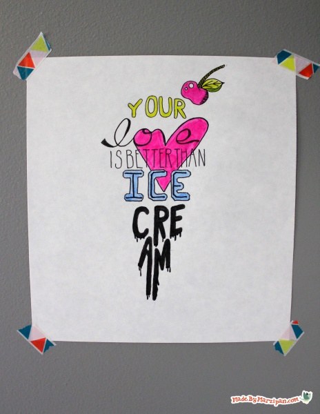
- You can draw the eye by connecting words at the crossbar or tail.
- You may want to shape the text to reflect the message.
- Choose a font style that reflects the word’s meaning. For example, “love” drawn in script, and “ice” drawn in block.
- Consider whether color would benefit your design.
- You may want to add a simple illustration within the word if it enhances the message.
- Try combining contrasting letter types: light and bold, tall and short, solid, empty, and patterned.
You can further embellish your work with frames, banners, borders, and dividers. Learn more by watching my Hand Lettering: Accents video!
Made By Marzipan may have received product or payment for this post. Posts may contain affiliate links. Disclosed in accordance with the Federal Trade Commission's 16 CFR, Part 255.
Original article and pictures take www.madebymarzipan.com site
Комментариев нет:
Отправить комментарий