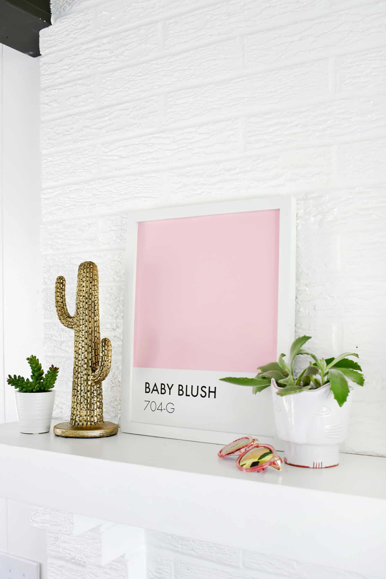
Deciding on paint swatches for your home can be a big deal. The hours of trying to decide which blue is juuuust right or which pink is “too pinky” can be a chore that drives you mad at times! I do love, however, gathering up all the paint swatches and laying them out in front of me just to see all the choices in colors and shades. Apparently the love for paint swatches runs deep because there’s been lots of fun plays on Pantone paint swatch art and projects like cookies, coasters, and magnets (love this food swatch collection). So I’m definitely not the only one obsessed with them. I wanted a simple print to put up on my mantel, and I thought some swatch inspired art would be just right. I made one look like a Pantone swatch for my dining room color Baby Blush (which is actually by Valspar but whatever!).
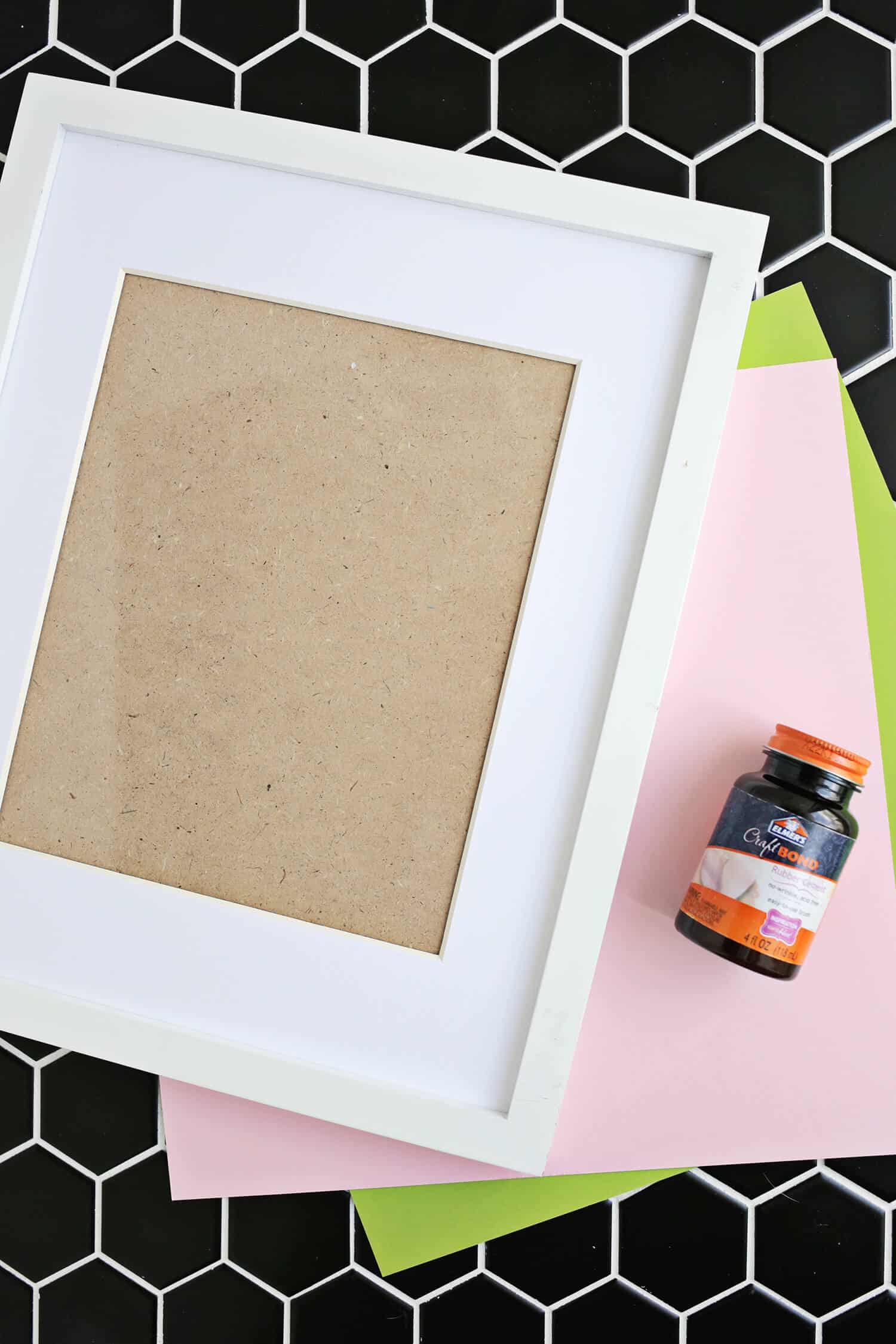
Supplies:
–11″x14″ size frame
-solid color of 12″x12″ paper
-white 8.5″x11″ card stock for the bottom of your frame
–cutting mat, metal ruler, and X-Acto knife
–rubber cement
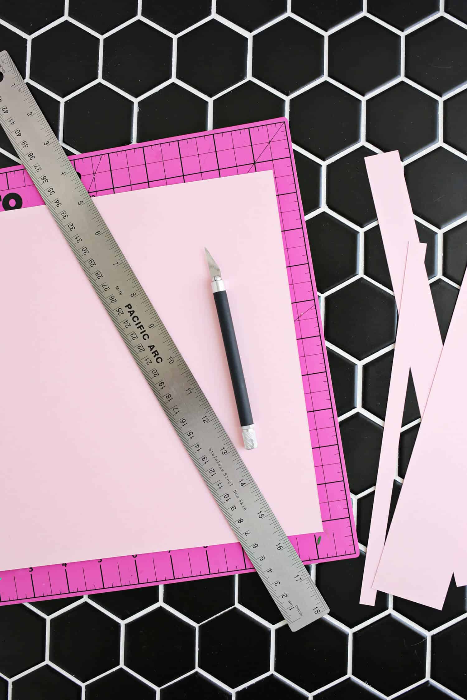
Start by cutting your colored paper to 11″x10″ (you’ll want a white area at the bottom where the name goes, so it won’t go all the way down).
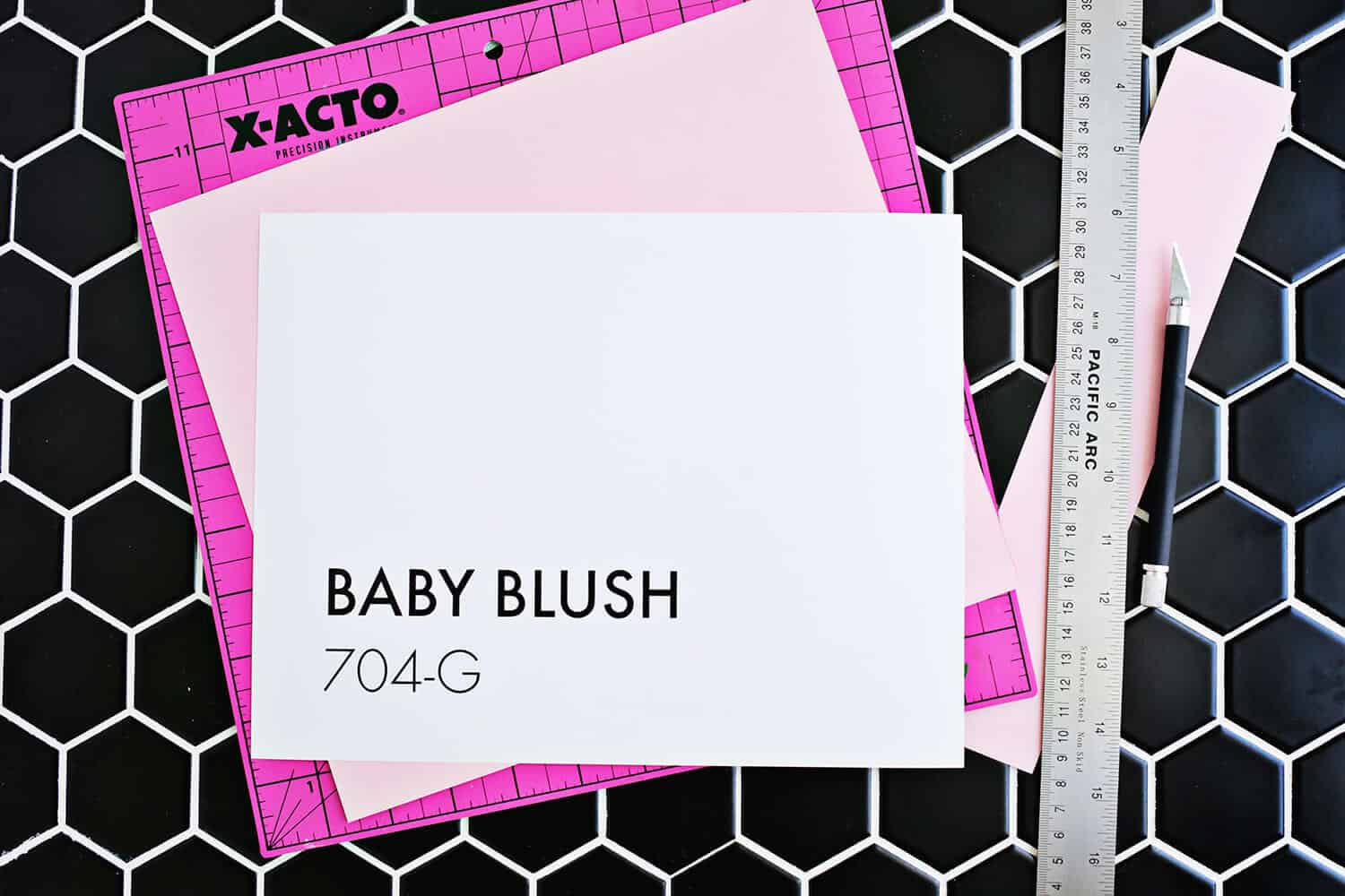
On a white piece of card stock, print out your paint swatch name and numbers in the bottom left corner of landscape mode so your paper will be 11″ wide (make up your own info if you want or if it’s not a real Pantone shade). You can get a simple, clean looking font from a free font site (like this one) if you don’t already have one, but I used Function Pro in a 78 point font.
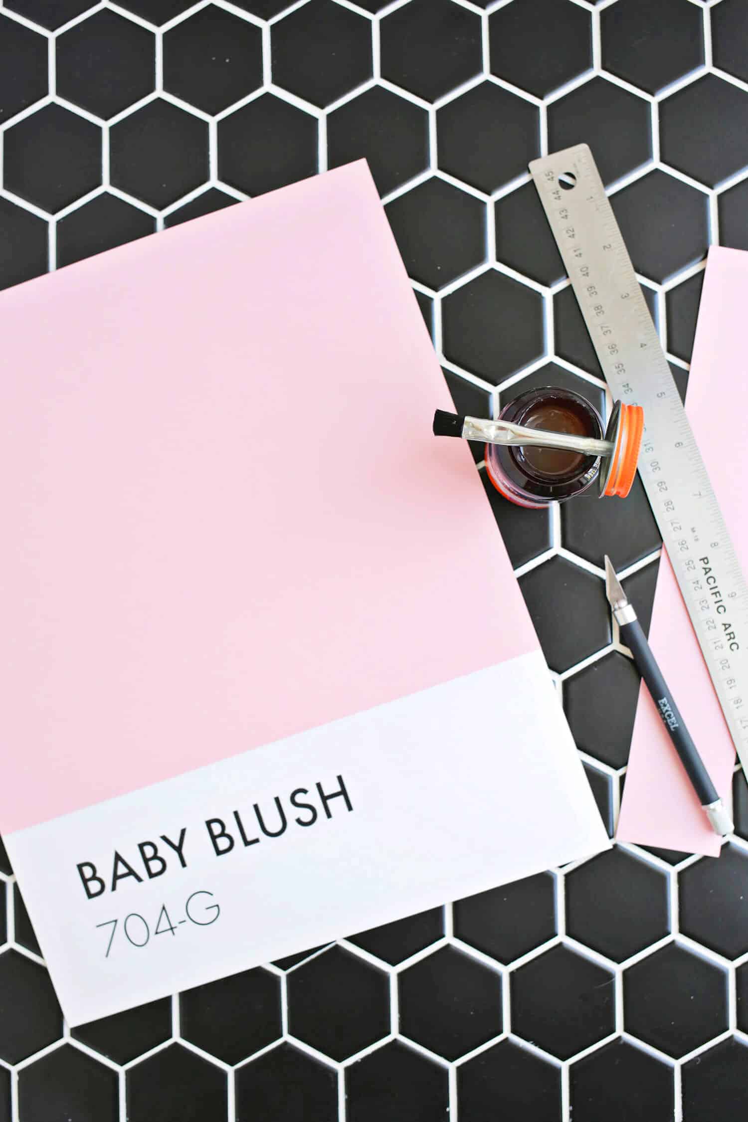
Line up your white paper so that it sticks out 4″ from under the colored paper and use your rubber cement to attach the two together.
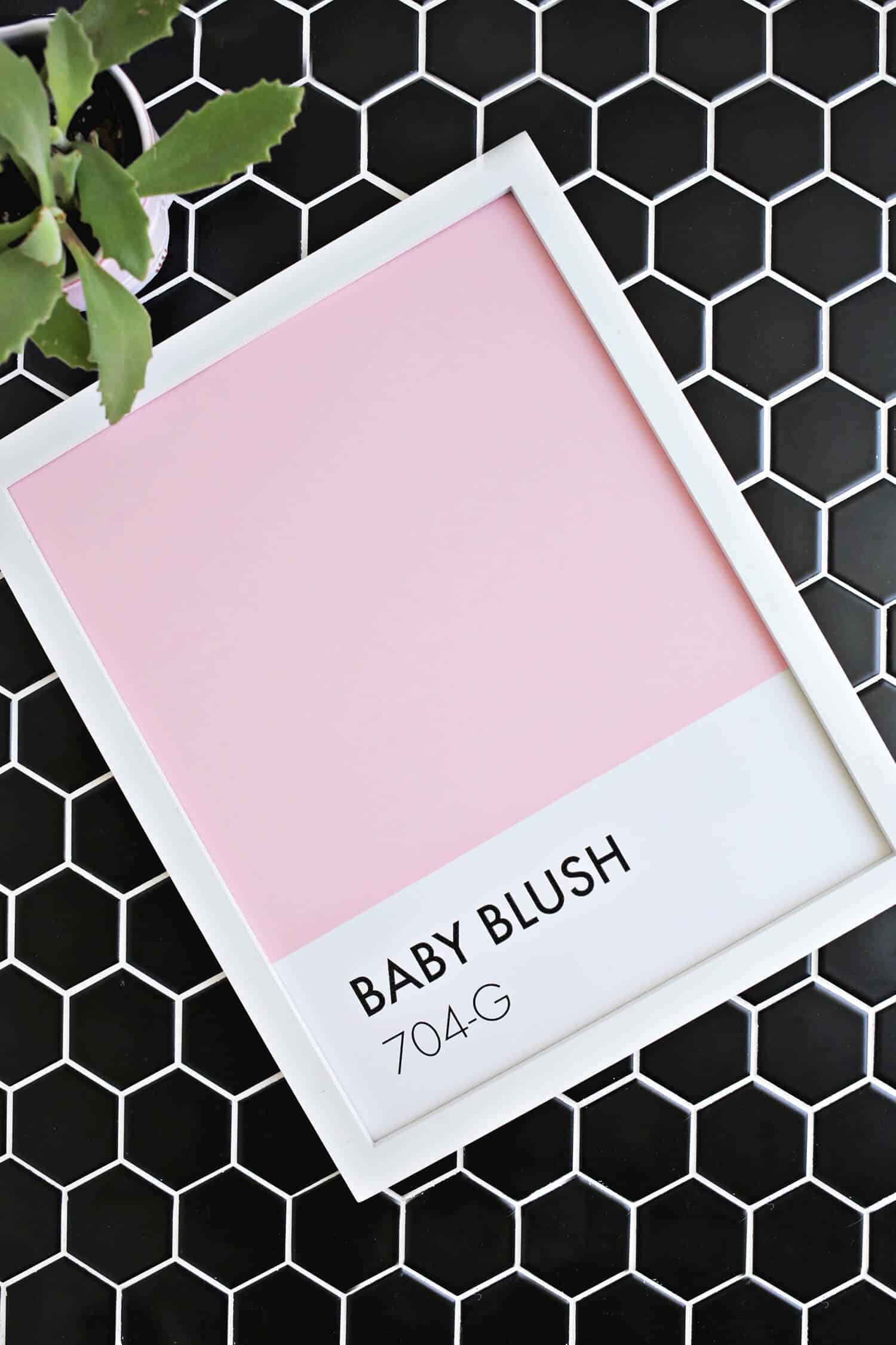
Pop your new art into the frame, and you’re done!
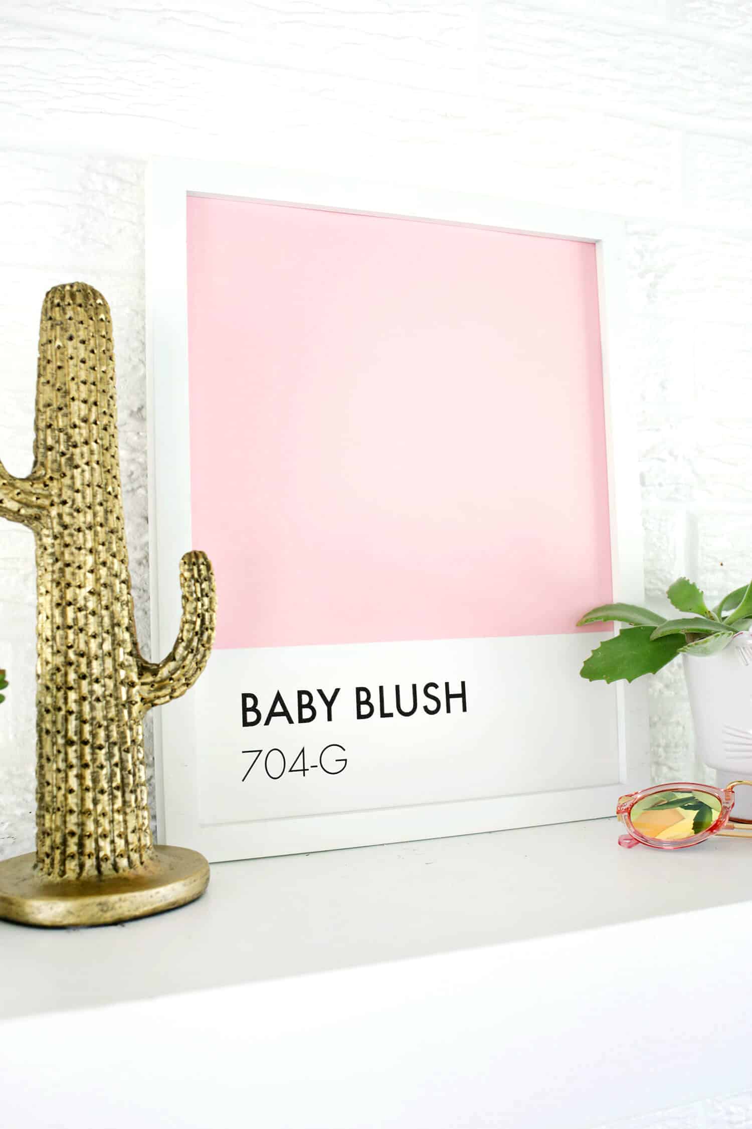
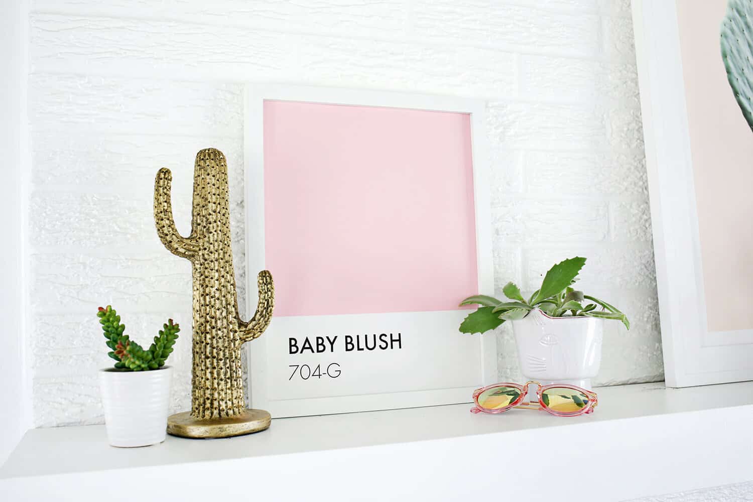
It looks just like the real thing! I like that it’s customized with a real color that I really do have in use all over my house. I just made up the color number underneath. This would be a great way to document all the main paint choices in your house so you can easily remember what they are when you need a touch up (maybe a little gallery wall of all your main colors together), or you can get creative and make one for your family name like “Gummerman Green” or whatnot. If you can’t find a shade of paper that is close enough, you could always use the actual paint and paint a thick piece of card stock instead. Anyway, it looks just right sitting on my shelf (and matches my new pink sunnies perfectly too), so I think it was just what the spot needed! xo. Laura
Credits//Author and Photography: Laura Gummerman. Photos edited with the NEW A Beautiful Mess actions.
Original article and pictures take abeautifulmess.com site
Комментариев нет:
Отправить комментарий